Project Overview
Improve VR & Web-based App by Research

Sales were strong, but usage was low. Why?
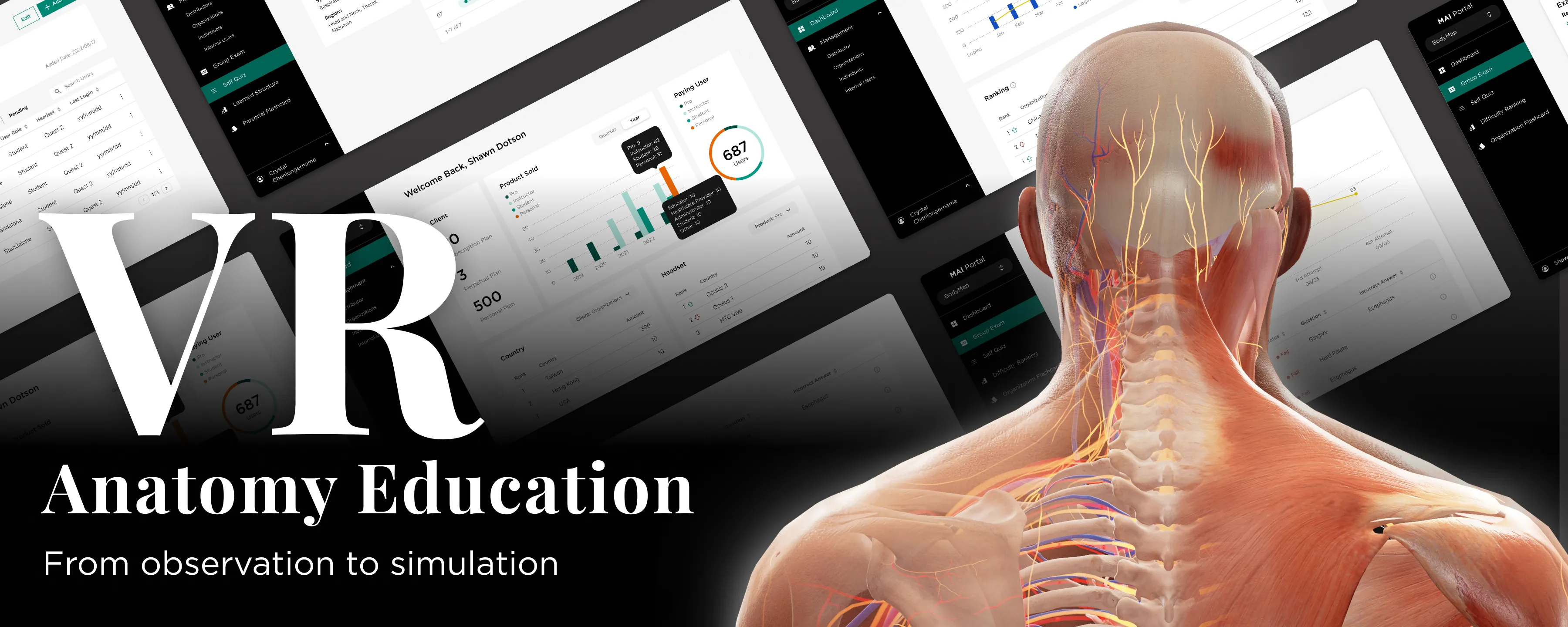
Instead of rushing to "fix the UI," I paused to diagnose the real friction: a fundamental mismatch between our VR tech and the classroom syllabus. Over a 15-month roadmap, I led a strategic pivot that bridged this gap—transforming our products from unused "shelfware" into essential teaching assistants and achieving a 90% student adoption rate at UCLA.
The Challenge
The Situation:
MAI had developed impressive VR technology for anatomy ("BodyMap") and acupuncture ("AcuMap"). While the sales team successfully placed the hardware in institutions, the product wasn't sticking.
The "Shelfware" Reality:
My initial audit of internal analytics revealed a concerning trend:
• 45% of users "Almost Never Used" the app (less than 10 sessions/month).
• Only 20% were active users.
The Core Problem:
The product was being sold as a revolutionary tool, but in practice, it was often gathering dust. Teachers faced a recurring struggle: "How do we actually use this in a formal class?". Instead of rushing to "make the UI prettier," I paused to diagnose why the technology failed to integrate into the daily rhythm of the classroom.
Research and Insights
I conducted qualitative interviews with our most active users (instructors at NTU) and research partners (UCLA) to understand the friction points.
Key Clinical Findings:
The barrier wasn't just usability; it was a fundamental mismatch in mental models:
1. The "Encyclopedia" Problem:
We were handing students a massive library of 5,000+ parts organized by "Body Systems" (Skeletal, Nervous). But professors teach by "Courses" (e.g., "Muscles of Mastication"). As I noted: “Our product is like throwing an encyclopedia at a user and asking them to learn from it”.
2. The "Black Box" Issue:
Instructors hesitated to use the tech because they couldn't see what students were doing inside the headset. Without a way to track progress, grading was impossible.
3. Cognitive Overload:
Medical students—often non-gamers—struggled with the complex VR controllers, leading to early drop-off.
Strategy and Roadmap
Adhering to the principle that "prescription without diagnosis is malpractice," I defined a 4-Phase Strategy to pivot the product from a "Reference Library" to a "Teaching Assistant".
• Phase 01: The Foundation (Web Portal)
Build the admin tools first so teachers can track usage and justify the technology.
• Phase 02: Validation
Partner with universities to test a new "Course-Based" information architecture.
• Phase 03: Optimization
Overhaul the VR App to align with the syllabus and fix onboarding.
• Phase 04: Innovation (Dissection)
Address the future market scarcity of cadavers.
Design Execution
Treatment A: Bridging the Gap (The MAI Portal)
The Goal:
Give teachers "eyes" inside the headset.
The Solution:
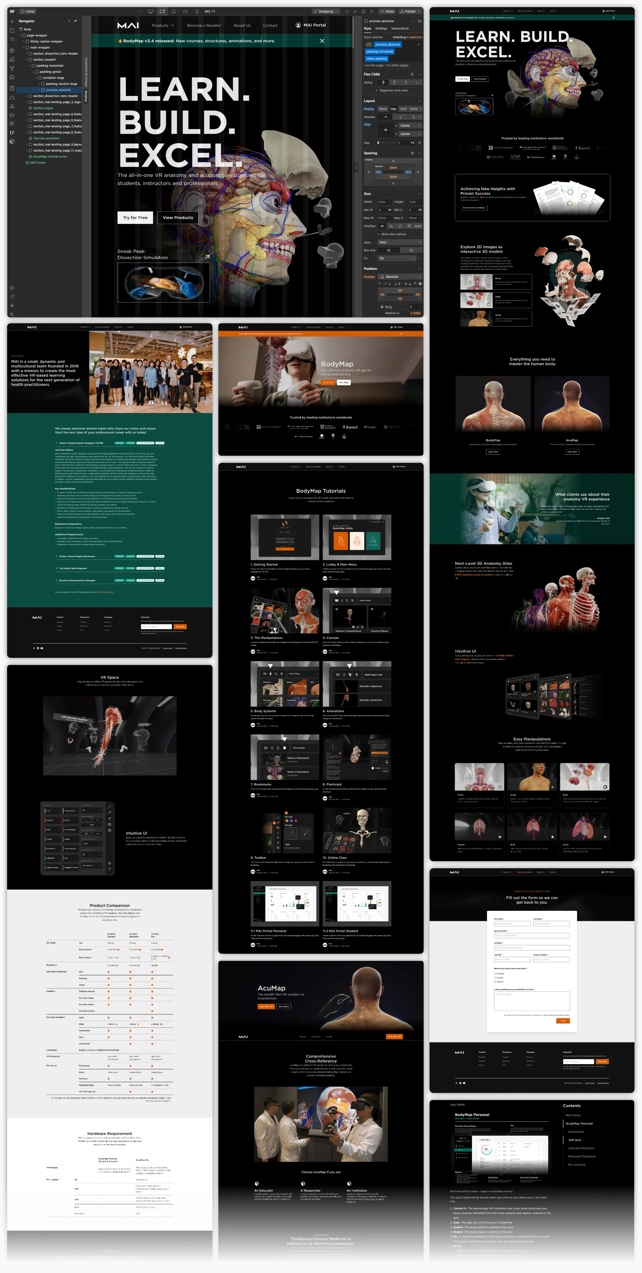
I established a design system using the MUI React library to create a comprehensive dashboard. Features like "Group Exam Scores" and "Playtime" tracking finally allowed instructors to grade VR performance, bridging the gap between the isolated headset and the classroom gradebook.
Treatment B: The Holistic Onboarding Ecosystem
The Diagnosis:
Friction existed both inside and outside the headset. Dealers couldn't explain the product, and students were overwhelmed by it. The Solution: I designed a dual-channel support system.
• 1. The Self-Service Knowledge Hub (Webflow CMS):
I built a responsive website using Webflow to host a complete curriculum library. This CMS system organized tutorials ranging from "Getting Started" (hardware setup) to complex lessons like "Acupuncture Simulation" (needle depth/angle).
◦ Friendly Touch: This freed up our engineers to focus on VR challenges while giving sales teams a reliable tool to answer client questions on the fly.
• 2. Reducing Cognitive Load in VR:
I redesigned the in-app tutorial to split the user's focus. The Left Panel now tracks progress (timeline), while the Right Panel details the specific gesture (Move, Rotate, Scale). This "one task at a time" approach ensures users master the controllers before tackling complex anatomy.
Treatment C: Structural Realignment (Course-Based UI)
The Goal:
Speak the teacher's language.
The Solution:
We moved away from the "Body System" default. I re-architected the library into a "Course System View," allowing students to select specific modules (e.g., "The Brain" or "Facial Muscles"). This simple shift meant the app finally aligned perfectly with their syllabus.
The Dissection Simulation
The Market Diagnosis:
While optimizing the current product, I identified a looming threat to medical education: "6 Students to 1 Body".
Insight:
With medical school enrollment projected to rise by 29.2%, cadavers are becoming scarce. Additionally, cultural constraints in some regions prevent the use of real bodies entirely.
The Strategic Prescription:
I proposed Dissection Simulation not just as a "feature," but as a scalable replacement for scarce physical resources.
The MVP Execution:
We avoided building a massive system all at once. Consulting with medical specialists, we defined the key learning points: incision site, depth, and angle.
Safety UI: I designed a "Warning System" to mimic real-world consequences. If a student cuts too deep into the skin layer, a collision detection triggers a "Too Deep!" alert. This trains precision safely before a student ever touches a patient.
Results
By diagnosing the root cause of "non-use" rather than just treating surface-level UI symptoms, we transformed the product's value.
• Adoption: The structural changes were validated by the market. UCLA reported that 90%+ of students embraced BodyMap for anatomy education after the redesign.
• Team Impact:

